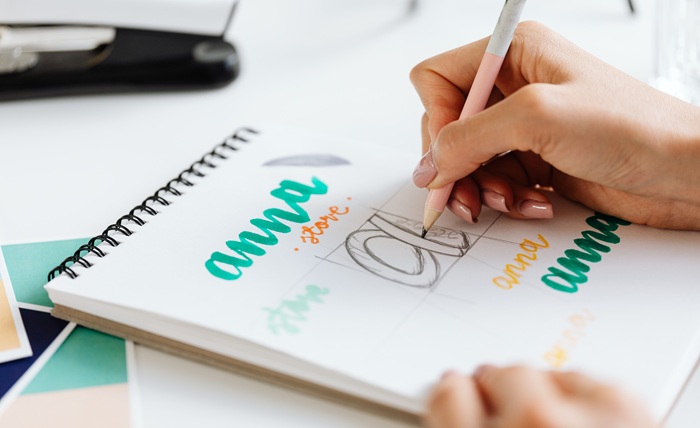
Every rebrand comes down to a budget decision eventually. Design a custom icon, or spend that money getting a typography logo right instead.
You’ll be surprised to know that more businesses are now choosing a typography logo, and the reasoning is financial, not just creative. A typography logo costs less, scales easily across business channels, and holds up better as the company grows into new markets.
If you’re evaluating a business rebrand right now, a logo design company is the safest bet for a wordmark logo because it protects your budget in the long run.
What is the cost problem with icon-based branding?
For some businesses, an icon-based logo becomes an ongoing expense. Icons need testing across cultures and markets to make sure they don’t mean something unintended somewhere.
They need to be redrawn every now and then to adapt to the platforms the logo appears on. They need separate simplified versions of favicons, watermarks, and merchandise.
A typography logo skips most of that hassle. Once the logo font and spacing are locked in, the asset works nearly everywhere with almost no ongoing production cost.
For growing businesses, this means fewer design invoices and fewer approval cycles pulling at the marketing budget.
Where do typography logos actually move the needle?
Here are some of the most convincing reasons why a typography logo should be your first choice.
Faster market recognition and lower ad spend
Brand recognition has a dollar value. That’s why companies pay for repeated business exposure. A unique typography logo builds that recognition faster because it puts your business name front and center.
Customers learn to recognize the shape of the letters on their own. Fewer impressions are needed before the customer trusts the name. That’s the real use of any marketing budget.
Lower risk during expansion
Businesses eventually expand. They enter new regions and launch new products. But a quiet risk lurks: losing brand equity. A symbol that reads as neutral in one market can carry an unintended meaning in another.
A strong typography logo removes that variable almost completely. There’s no icon to mistranslate. The name stays the same, everywhere it goes.
Easier franchise and licensing rollout
For businesses that franchise, license, or run multiple locations, consistency isn’t just a design preference. It’s an operational requirement.
Clean typography is simpler to license out, simpler to enforce through brand guidelines, and harder for a partner or franchisee to use incorrectly than a detailed icon logo.
What does the research say about simplicity and brand value?
The need for a typography logo isn’t just a hunch floating around in the marketing departments. Interesting research backs it: simplicity and brand value matter.
Research from Harvard Business Review has found simplicity and consistency in visual identity build stronger long-term brand equity than novelty or complexity. Complicated marks might pick up design awards, but simple, well-executed type logos tend to win the actual market.
Design research from Nielsen Norman Group backs the need for a type logo from a usability angle. Simpler visual systems perform better across digital touchpoints because they ask less of the customer’s attention.
Less friction between someone seeing your name and remembering it means better conversion efficiency, brand recall, and stronger first impressions.
How can you build a strong typography logo that actually protects the business?
Not every wordmark logo is a business asset. Weak ones can easily become a liability that can lead to costly redesigns. A few things separate a durable typography logo from one that needs replacing every three years.
You need a custom logo type, not a stock logo font
Off-the-shelf fonts are available to any competitor with the same software license. This weakens trademark protection.
A creative typography logo, built with custom-adjusted letterforms, is harder to copy and easier to defend legally as a distinct mark. That matters for any business planning to register a trademark down the line.
A font strategy tied to the market position
The right font for logo use should reflect where the business actually sits in the market. Is it premium, accessible, technical, or traditional?
Getting this wrong is expensive. It either undersells a premium product or overpromises a budget one. This choice deserves the critical thinking you put into pricing. It’s not a decision made after the business plan is already finished.
Spacing and weight that hold up at scale
A mark that looks fine on a business card can fall apart on a delivery van, an app icon, or a trade show banner. Testing spacing and weight across every real application, not just a mockup, is where top-rated logo design companies earn their fee. The catch problems before they turn into redesign costs.
When does an icon still make business sense?
We are not saying that an icon might not be the right choice at all. It just might not be right for the budget you’ve saved up for branding.
There are cases where a typography logo isn’t the right call. Businesses in regulated industries like healthcare, safety, and transportation often need a symbol that communicates instantly, regardless of language.
Companies built around a strong mascot or product character may lose equity if they drop it. In those cases, a combination mark protects existing brand investment better than switching entirely to a typeface.
The bottom line
A typography logo isn’t just a design trend. It’s a lower-risk, lower-cost, more scalable option for most growing businesses. It cuts production overhead, travels across markets more safely, and builds recognition without leaning on an icon that needs constant reworking.
Before signing off on the next rebrand, ask a simple question: Is the icon actually earning its keep, or is it just adding cost that a typography logo could handle on its own? For most businesses, the type does the job.